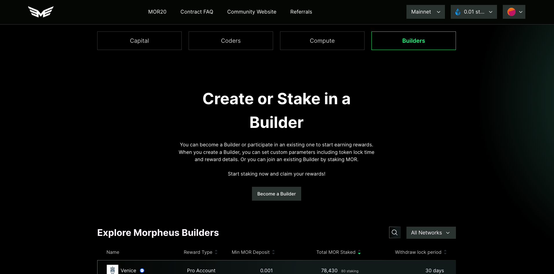
Builders Dashboard Home design
The entire screen is taken up with text. I think the UI could be improved toward the goal of Builder discoverability
- move the list further to the top
- remove the block of text
- move the become a builder to be just above the builder table
Please authenticate to join the conversation.
Upvoters
Status
Completed
Board
⬆️
UI/UX Improvements
Date
About 1 year ago
Author

Kevin
Subscribe to post
Get notified by email when there are changes.
Upvoters
Status
Completed
Board
⬆️
UI/UX Improvements
Date
About 1 year ago
Author
Kevin
Subscribe to post
Get notified by email when there are changes.